

Boho Chic Decor: How to Layer Textures and Patterns Without Turning Your Space Into a Cluttered Mess

Open with the tension between boho's visual richness and its tendency to look chaotic, then introduce curated layering as the answer—setting up the article angle without restating it.
What Actually Makes Boho Chic Distinct From Eclectic or Hippie Styles
The word “boho” gets slapped on everything from thrift-store finds to $800 designer pillows, which is probably why so many people end up with spaces that feel more like a garage sale than a style. The key difference between boho chic and the broader eclectic or hippie aesthetics comes down to intentionality—how deliberately you’re curating what goes on your walls, floors, and shelves.

Common visual markers of boho chic vs. other eclectic styles
Hippie-style interiors tend toward maximalism in the literal sense: every surface covered, every corner filled, and a heavy reliance on tie-dye, mandalas, and those giant woven dreamcatchers that look like they belong at Coachella rather than your living room. Eclectic decor can be anything goes—mid-century modern alongside farmhouse, industrial with cottagecore—and often reads as a collection of favorite pieces rather than a cohesive style.
Boho chic lives somewhere between those two. It’s warm and layered but rarely overwhelming because it follows a few unwritten rules: you’ll see lots of textiles layered in (think throw pillows on top of throws on top of blankets), the patterns tend to be organic or geometric rather than literal florals or stripes, and there’s always an element of the handmade—whether that’s actual handwoven pieces or things that look like they were. A boho chic living room will have character without feeling like a museum of your travels.
The practical difference for someone decorating on a budget? Boho chic is more forgiving than strict eclectic design because it embraces imperfection and secondhand finds as part of the aesthetic, not despite them. You can layer three different rugs over each other and have it look intentional rather than accidental.
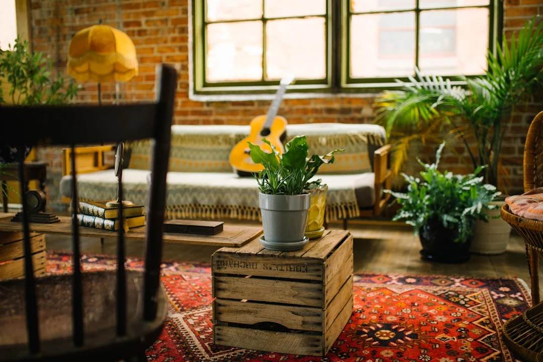
The role of natural materials in defining the look
What actually anchors boho chic decor to a specific place on the design spectrum is its heavy reliance on natural, tactile materials. Rattan chairs that you can see through rather than opaque upholstered ones. Jute rugs with visible texture underfoot. Macramé plant hangers that serve both function and visual interest. Even the wood in boho spaces tends to be warm-toned and often unfinished or lightly distressed.
This matters because natural materials create a built-in visual hierarchy. A woven rattan floor lamp doesn’t compete with your colorful pillows—it supports them. It’s the kind of piece that works whether you have one accent pillow or twelve, which is exactly what you need when you’re still learning how to layer textures without cluttering up your space.
If you’re furnishing a boho chic bedroom and wondering where to invest versus where to save, prioritize pieces made from these natural materials. A solid rattan headboard will outlast and outstyle the trendy fabric-upholstered ones that tend to date quickly. Jute or sisal runners cost less per square foot than most area rugs and age gracefully with visible wear.
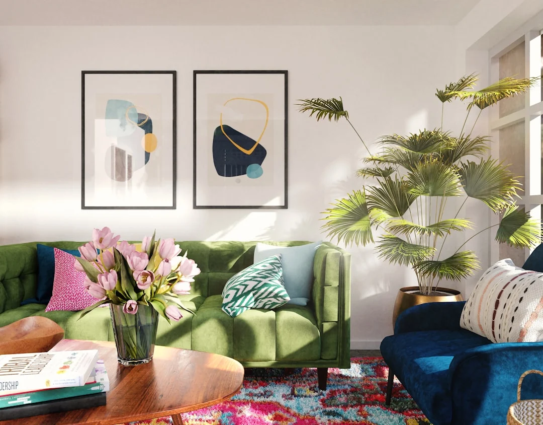
How earth tones anchor the palette and prevent visual overload
The boho color palette is where things get tricky for people who’ve seen too many bohemian interiors on Pinterest. The mistake is thinking “boho” means every surface in your space needs to be a different shade of terracotta, sage, or mustard. A well-designed boho space uses earth tones as the foundation and lets brighter colors work harder.
Think of it this way: if you’re mixing patterns in boho home decor, start with a base of warm neutrals—cream walls, taupe furniture, brown wood tones—and then introduce color through textiles. A patterned pillow in burnt orange reads differently against a cream sofa than it does against a navy one. The earth tones do the work of tying everything together so your space looks curated rather than chaotic.
For renters especially, this approach is worth knowing because you can achieve a boho chic color scheme with earth tones without painting or buying new furniture. A set of layered linen curtains in warm beige, a jute rug over existing carpet, and a few throw pillows in terracotta and sage will transform the visual weight of your space without requiring any permanent changes.
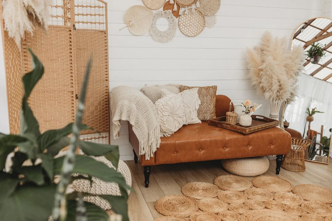
The trade-off is that earth-tone-dominant boho spaces can feel slightly muted if you don’t introduce enough contrast. A dark wood coffee table against cream walls, or black-framed art against a warm-colored sofa, creates just enough visual pop to keep the room from feeling flat.
Choosing a Boho Color Scheme That Grounds Patterns Without Dulling Them
The biggest mistake people make when building a boho chic living room is letting every pattern fight for attention. A rug with intricate Moroccan motifs, a throw pillow in ikat, a woven wall hanging in jute, and a vintage chair that’s seen better days can easily create visual noise instead of the relaxed, curated feeling you want.
Color is your anchor. When patterns share a coherent palette, they complement each other rather than compete. The trick is knowing which colors should lead and which should follow.
Why Earth Tones Work Better as a Base Than Bright Primaries
Earth tones—terracotta, sage, ochre, warm browns, and deep terracotta reds—absorb visual complexity. A mustard-yellow pillow over an earthy backdrop reads instantly as intentional, while the same yellow against a stark white wall can feel like an afterthought.
Consider how a woven rattan basket looks on different surfaces. Against cream or warm beige walls, it blends into the background and lets its texture shine. Against bright blue or pink walls, it competes for attention. In bohemian interior design, you want your natural materials to breathe rather than shout.
This doesn’t mean your space needs to be brown. It means earth tones should form the foundation layer—the wall color, the largest piece of furniture, the floor covering—while brighter or more saturated colors live in accessories and textiles that are easy to swap out when you want a refresh.
How to Pick 2–3 Accent Colors That Complement Rather Than Compete
Once your earth tone base is set, choose two or three accent colors using one of these reliable approaches:
- Analogous accents: Pick colors that sit next to each other on the color wheel. A terracotta base with mustard and burnt orange creates warmth without overwhelming.
- Complementary accents: Pair your main earth tone with a color opposite it. Sage walls with rust or ochre pillows create subtle contrast while staying cohesive.
- Muted jewel tones: Deep teal, plum, or emerald work beautifully in boho spaces when they’re kept to accessories rather than large surfaces.
The key constraint is limiting yourself. If you introduce a fourth or fifth color at the same saturation level as your accents, patterns start colliding. A good rule of thumb: one accent color should dominate, one should support, and any additional tones should be quieter versions of those two.
What Happens When the Palette Gets Too Warm or Too Neutral
A too-warm palette—everything leaning toward orange, yellow, or red—can feel heavy and dated. It’s especially noticeable in boho chic bedroom styling, where warm tones on all surfaces can make the room feel smaller than it is. The solution isn’t to cool things down entirely, but to introduce a neutral anchor. A cream-colored rug, white linen sheets, or a pale gray armchair breaks up the warmth without creating contrast.
A too-neutral palette—whites, beiges, grays with little saturation—risks looking like a Scandinavian space dressed in boho clothes rather than a true eclectic bohemian interior design. layered boho textiles lose their personality when the background is too pale. Add depth through texture: a chunky knit throw on a smooth linen sofa, macrame plant hangers against painted walls, or vintage furniture with patina that reads as warm gold rather than flat beige.
Before committing to a color scheme, test it at different times of day. North-facing rooms absorb more natural light and can make warm colors read slightly cooler; south-facing rooms amplify warmth. The same terracotta pillow looks entirely different in morning light versus evening lamplight—and your patterns should feel cohesive in both.
Layering Textiles So They Add Depth Instead of Clutter
Start with a large-scale texture before adding smaller layers
The mistake most people make when building boho chic decor is reaching for the smallest statement piece first. A woven macrame wall hanging looks beautiful on its own, but without context it reads like an accessory rather than part of a room. Instead, anchor your space with something that covers square footage—a chunky jute rug, a hand-woven kilim, or a heavy linen drape—before layering anything on top.
Think about scale as your guiding principle. A large textured rug establishes the visual weight of the room. On top of it, introduce a medium-scale piece like a patterned throw blanket draped over a rattan chair. Finally, add smaller textiles in complementary textures: a velvet cushion, a fringed pillow, or a crocheted coverlet. This progression from big to small gives boho chic living rooms their characteristic depth without overwhelming the eye.
Consider what happens when you reverse this order. Place three small throws on a bare floor and you get scattered accessories. Layer them over a substantial rug and they become intentional pieces in a composition. The same principle applies to curtains, bedspreads, and even wall hangings—the larger textile underneath gives smaller ones somewhere to rest.
The rule of three: how many textiles are enough for a boho room
Bohemian rooms thrive on abundance, but abundance without structure looks like a garage sale. The rule of three offers a reliable framework: group your textiles in odd-numbered clusters of three to five per visual zone. On a sofa, for example, you might have one large pillow with a bold pattern, one medium pillow in a complementary texture, and one small decorative piece that ties the color palette together.
This works because the human eye finds satisfaction in triads—three creates balance without rigidity. But “rule of three” doesn’t mean exactly three items everywhere. It means every cluster should have a clear focal point, a supporting texture, and something that adds contrast. A boho chic bedroom styling scheme might feature a woven headboard (focal), linen bedding (supporting texture), and a macrame wall hanging with earth tones (contrast). Three textiles, one job each.
The hardest part is knowing when to stop adding. If you’re sourcing affordable boho chic decor ideas for renters or shopping secondhand, it’s tempting to keep collecting. Before placing a new textile in your space, ask whether it introduces a texture or pattern that doesn’t already exist. If your room has woven rattan, linen, and cotton, adding another piece of similar material creates redundancy rather than depth.
When to layer and when to let pieces breathe
The most polished bohemian interiors understand restraint as much as accumulation. Layering works best in areas designed for gathering—living rooms, bedrooms, reading nooks—where textiles create warmth and invitation. Let larger architectural elements breathe: a tall floor lamp or a single statement chair doesn’t need to be surrounded by patterned pillows and throws to look intentional.
Here’s a practical test: stand back from your room and squint until the details blur. If you can still identify distinct textures, your layering is working. If everything merges into one muddy mass of color and pattern, pull back one or two pieces. This works especially well with boho vintage furniture—let an antique wooden credenza or a rattan armchair stand alone against textured walls rather than competing with them.
Another factor to consider is the room’s purpose. A boho chic bedroom benefits from heavier layering because it’s a cocoon-like space. A home office in eclectic bohemian interior design style should lean toward fewer, more substantial textiles that add personality without visual noise around your workspace.
Finally, don’t forget about negative space—the areas between your textiles matter just as much as the textiles themselves. When mixing patterns in boho home decor, let some walls remain bare or partially bare so the eye has somewhere to rest. A room full of layered textiles with nothing to look at becomes exhausting rather than inviting.
Mixing Patterns Without Creating Visual Noise
The biggest mistake people make when styling a boho chic living room is treating every pattern as if it needs equal attention. A rug with geometric lines, a sofa covered in ikat, curtains in florals, throw pillows stacked with paisley and stripes — suddenly your walls are shouting over each other. The trick isn’t to use fewer patterns; it’s to give each one a clear role.
The scale hierarchy: pairing large, medium, and small patterns
Think of pattern mixing like building a visual pyramid. Your largest surfaces — rugs, upholstery, accent walls — should anchor the room with bold, easy-to-read motifs. A jute rug or a macramé wall hanging works here because its scale is generous enough to read from across the room without competing.
Medium-scale patterns live on throw pillows, curtains, and smaller furniture pieces. They bridge the gap between big statement shapes and tiny details. A woven rattan side table with carved detailing sits comfortably in this tier.
Small-scale patterns — think delicate florals on a cushion cover or subtle stripes on a linen sheet — become your finishing layer. You don’t need many of them, but they add richness when you’re close enough to notice.
Start with one large pattern as your foundation, add two medium ones, and finish with up to three small patterns. If you can’t identify which is which at a glance, you’ve probably got too much fighting for attention.
Why shared color threads matter more than matching motifs
You don’t need every pattern in your boho chic bedroom styling to share the same motif — stripes don’t have to be paired with only other stripes. What actually keeps a room feeling curated rather than chaotic is a consistent color thread running through everything.
When you pull earth tones into each pattern, even wildly different ones start conversing instead of clashing. A terracotta ikat pillow next to a sage green botanical print feels intentional because they’re both sitting on the same warm, natural palette. Add in woven rattan decor and vintage furniture with muted wood tones, and suddenly your layered boho textiles are working as a unit.
Here’s a practical rule: pick three to five colors that will appear across all your patterns. If a new piece you’re considering — whether it’s an affordable boho chic decor idea from a thrift store or a larger investment like boho vintage furniture — introduces a color outside that range, ask yourself whether it earns its place. Does it add something the others don’t? Or does it just add noise?
Common pattern combinations that work (and the ones that fight each other)
Some patterns naturally complement each other because they share a similar energy or visual weight:
- Ikat and ikat — Layering different scales of ikat works surprisingly well, especially when one leans warm (terracotta, mustard) and another cool (indigo, teal).
- Florals with stripes — A classic pairing that keeps things feeling relaxed without being too busy. Think a botanical print on your sofa paired with striped curtains.
- Geometric patterns with organic shapes — A trellis rug under a macramé wall hanging creates contrast without confusion.
- Paisley and ikat — Both carry that handcrafted, globally-inspired feel that’s central to eclectic bohemian interior design.
Avoid pairing two large-scale patterns of similar visual weight in adjacent areas. A big floral sofa next to a equally bold geometric rug will create competition rather than harmony. Similarly, don’t stack too many high-contrast patterns together — if every piece is shouting with strong lines or vivid colors, your boho color palette loses its grounding.
When you’re pulling this all together for how to style a boho living room without clutter, remember: the best pattern mixing leaves room for breath. Let your plants breathe between furniture pieces. Allow negative space around your woven rattan decor. The goal is an eclectic bohemian interior design that feels collected over time, not assembled in one shopping spree.
Plant Selection for Boho Spaces: Thriving vs. Aesthetic
The plants you choose for a boho chic living room or bedroom set the tone for everything else. Too many delicate specimens that wilt after a month of neglect, and your carefully curated space starts looking like a plant graveyard. Too few, and the whole aesthetic falls flat. The trick is finding species that bring genuine character to layered boho textiles while surviving on their own terms.
Which plants look boho but survive low light and irregular watering
Succulents in a terracotta pot might scream “bohemian interior design” in catalogs, but they demand more attention than most homeowners give them. Instead, reach for the workhorses that deliver maximum aesthetic payoff with minimum fuss:
- Snake plants — Their upright, sword-like leaves provide architectural contrast to flowing macramé and woven rattan decor without demanding much beyond occasional watering.
- Pothos — Tolerates both bright indirect light and the darker corners of a boho chic bedroom styling scheme. Trailing vines from a high shelf create that effortless layered look.
- Spider plants — Produce baby plantlets that cascade downward, adding movement to an otherwise static space. They’re forgiving about watering schedules and don’t mind being slightly root-bound.
- Zamioculcas zamiifolia (ZZ plant) — Thrives on neglect and casts a glossy, sculptural presence that photographs well in eclectic bohemian interior design settings.
If you’re someone who travels or forgets to water regularly, prioritize plants over aesthetics. A snake plant that lives for years looks better than a fiddle-leaf fig that dies twice a season.
When a trailing plant adds charm versus when it becomes clutter
Trailing plants are the bread and butter of boho chic decor, but they can quickly turn your space into a green jungle if you don’t manage them intentionally. The difference between “styled” and “overgrown” often comes down to three factors: placement, pot size, and pruning discipline.
Let a pothos trail from one bookshelf in a boho chic living room — it creates vertical interest without competing for attention. Let three different trailing varieties compete on the same surface, and you’ve got tangled greenery that looks like an accident rather than a design choice. Similarly, hanging plants work beautifully when positioned deliberately: one in a macramé hanger above a rattan chair, another suspended from ceiling hooks near a window — but don’t crowd every corner with baskets unless you have the space to let them breathe.
Choosing pots that complement the natural-material palette
The pot is as important as the plant in boho chic decor. A beautiful species housed in plastic makes your whole scheme feel cheap, while the same plant in woven jute, terracotta, or concrete reads intentional and layered.
Look for pots with texture — ribbed ceramic vessels, hand-thrown stoneware, or baskets wrapped around a simple inner pot. Earth tones from sage to burnt orange to warm beige anchor your boho color palette naturally. Avoid glossy finishes unless you’re deliberately contrasting them against matte textiles and wood furniture.
When sourcing secondhand, don’t worry about matching pots perfectly. A collection of mismatched vintage containers in complementary materials reads more authentically bohemian than a set of identical pieces from the same store.
The plants you choose should reflect how you actually live, not just how they look in a Pinterest board. Start with two or three that thrive, then add statement pieces as your confidence grows.
Vintage Finds Worth Buying vs. Secondhand Bargains That Belong in Boho Chic
What to Invest In and What to Source Secondhand
Boho chic decor thrives on a mix of old and new, but not every piece deserves your full budget. Mid-century furniture with clean lines—think an Eames-style chair or a teak sideboard—becomes the anchor in a boho living room because it grounds the layered textiles without competing for attention. Quality textiles are another smart investment: a good wool throw, handwoven cotton throws, and natural-fiber rugs like jute or sisal hold their shape and color through years of use, which matters when you’re building out an eclectic bohemian interior design across rooms.
On the other end of the spectrum, items you can source secondhand include most decorative pillows, small side tables, floor lamps, and wall hangings. A macrame piece from a local market or thrift store works just as well as a designer version for boho chic bedroom styling, and woven rattan decor—planters, baskets, mirror frames—tends to be affordable at flea markets because the material itself is inexpensive. The trick is knowing which pieces gain character through age and which ones simply look tired when secondhand.
Spotting Vintage Furniture That Fits Boho Without Looking Thrifted
The difference between vintage furniture that elevates a boho space and pieces that make it feel like an estate sale has to do with patina versus damage. Look for wood with a warm, slightly uneven finish—this reads as intentional rather than worn down. A mid-century credenza with one drawer that sticks is charming; a dining chair with a splintered leg and loose joint is not.
Boho vintage furniture works best when it has natural materials woven into its construction: cane seats, rattan backs, leather straps, or exposed joinery. These details align with the earth tone palette that defines boho chic decor, creating visual cohesion even when you’re mixing patterns in boho home decor across different rooms. Avoid pieces that are overly ornate—baroque-style mirrors and gilded frames tend to pull away from the relaxed aesthetic unless you use them sparingly as focal points.
If you’re unsure whether a piece fits, hold it against your existing color scheme. A mustard-toned armchair or a deep terracotta side table will usually work in a boho setting even if the style is unexpected, because the woven rattan decor and layered boho textiles create enough texture to absorb visual variety.
When a Cheap Piece Elevates vs. Drags Down the Space
A cheap piece becomes an asset when it introduces one strong element that pulls the room together: a bold pattern, an unusual shape, or a material you don’t already have in abundance. A $15 vintage pillow with indigo dye adds color and texture to a boho chic living room without breaking your budget. The same pillow in faded brown polyester would look like clutter.
Conversely, cheap pieces drag down a space when they compound visual noise. Three mismatched throw pillows from the dollar store on one chair create that “I just grabbed whatever was nearby” effect rather than a curated bohemian aesthetic. The solution is to treat inexpensive items as accents—use them in sets of three or five, choose a consistent color family, and place them where they can be seen against solid surfaces like painted walls or wood floors.
Consider the rule of scale: larger furniture pieces benefit from investment because they define the room’s proportions. Smaller accessories thrive on secondhand sourcing. This is especially relevant for affordable boho chic decor ideas for renters, who may not want to commit to a large mid-century sofa but can easily swap out throw pillows and table lamps as their collection grows.
Practical Decision Criteria
Before buying any vintage or secondhand piece for your boho space, ask yourself these questions:
- Does it have structural integrity? A rattan chair with a loose weave can be repaired; one with broken spokes usually cannot.
- Will it age gracefully in my color scheme? Earth tones from the boho color palette—terracotta, olive, mustard, cream—are forgiving and pair well with most vintage finishes.
- Does it offer something I don’t already have? If your living room is full of wood furniture, add a metal floor lamp or a woven textile instead.
- Can I see this piece in six months and still like it? Trendy boho pieces often look dated within a year; classic mid-century shapes endure.
Pick one room, choose three textures and two patterns from the palette above, and swap out your biggest piece first—then build outward.
Related posts:
Tagged: Boho Chic Decor, Boho Chic Living Room, Boho Color Palette Earth Tones, Eclectic Bohemian Interior Design, Home Decor, Layered Boho Textiles, Plants For Boho Spaces, Woven Rattan Decor