

Neutral Room Decor Is a Layered System of Warm, Cool & Earth Tones

Start by positioning neutrals as more complex than most people assume: they're not one shade but a system of warm, cool, and earth tones that must work together with lighting, flooring, and furniture. Note the common mistake—choosing paint before understanding how existing wood floors or natural light will shift the chosen neutral—and set up the article's promise to help readers build cohesion instead of flatness.
Warm Neutrals vs Cool Neutrals: Which One Fits Your Lighting?
The Kelvin Scale and How It Shifts Beige, Gray, and Cream
Lighting changes the way a neutral reads. A cream wall painted in soft daylight can look honeyed at sunset, while a gray floor might pick up lavender undertones from morning north light. The trick is understanding color temperature in Kelvin before you commit to any shade.

Warm light (around 2700K–3000K) pushes beiges toward gold and grays toward taupe. Cool light (4000K and above) lifts creams into a flatter white and makes pale blues feel sharper. If your home already has warm-toned recessed lighting or vintage-style bulbs, expect any gray you choose to lean slightly earthy rather than clinical.
Warm Neutrals — Beige, Cream, Taupe
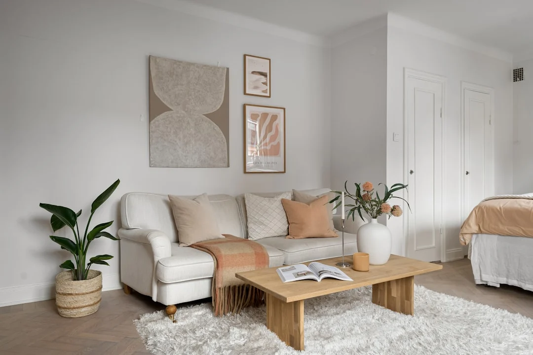
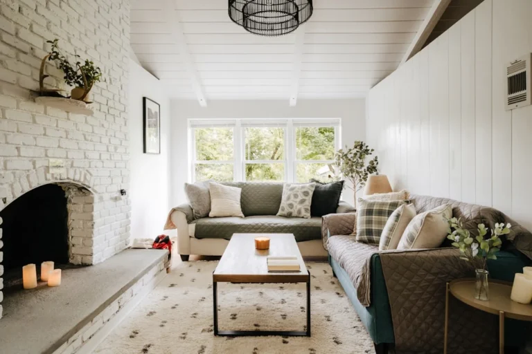
Warm neutrals are the most forgiving place to start. They harmonize with oak floors, wood furniture, and natural sunlight without creating contrast that fights the room itself. A beige wall paired with a cream sofa and taupe throw pillows reads as intentional rather than accidental.
The pitfall is picking too many similar warm shades. Beige walls, cream carpet, and tan curtains can all collapse into one flat tone if they don’t have enough contrast between them. Layer in texture — linen, wool, wood grain — so the room feels rich instead of washed out.
Cool Neutrals — Gray, White, Pale Blue-Gray
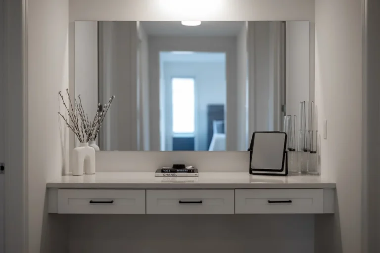
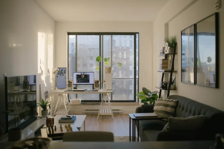
Gray and white work best when you want a room to feel open and calm. They are ideal for small spaces because they reflect light rather than absorb it, but only if your walls have enough contrast with the floor and ceiling.
Pale blue-grays (think Benjamin Moore’s “Gray Owl” or Sherwin-Williams “Agreeable Gray”) bridge the gap between warm and cool. They work in rooms that get mixed lighting — say, a living room with both south-facing windows and artificial overheads — because they don’t swing too far one way under any single light source.
How to Test a Neutral Under Your Room’s Natural Light
Purchase sample pots of two or three neutrals you’re considering. Paint them on large swatches (at least 12 by 18 inches) and move them around the room throughout the day. Observe how each shade changes from morning to evening. A neutral that looks perfect in the paint store often reads differently under your own lighting.
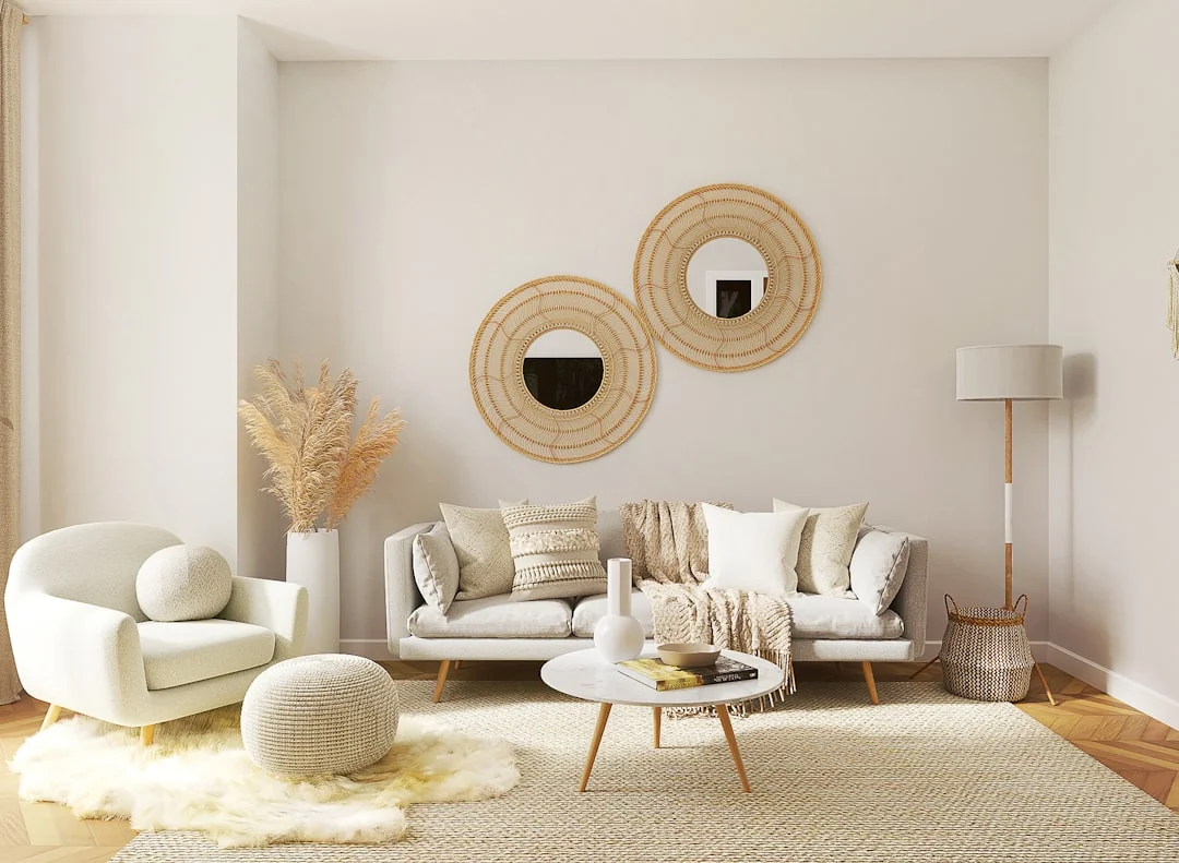
Take a photo of each sample at different times — morning, midday, evening — so you can compare them side by side later. This is especially helpful when choosing between beige and cream wall colors, since the difference is subtle until you see it in actual light.
Layering Beige, Cream, and Gray Without Creating Visual Noise
The core problem with beige, cream, and gray is that they’re similar enough to feel like the same shade until you put them side by side — which is exactly why people end up with rooms that look flat or sterile. The solution isn’t picking one perfect neutral; it’s treating these tones as a system where each plays a specific role in the room’s visual hierarchy.
The 60-30-10 Rule Applied to Neutral Palettes
Start with paint, because it covers the most surface area and sets the temperature for everything else. A creamy white wall will read differently against oak floors than it does against gray laminate, and that difference matters more than you’d think when you’re trying to layer colors together without creating visual noise.
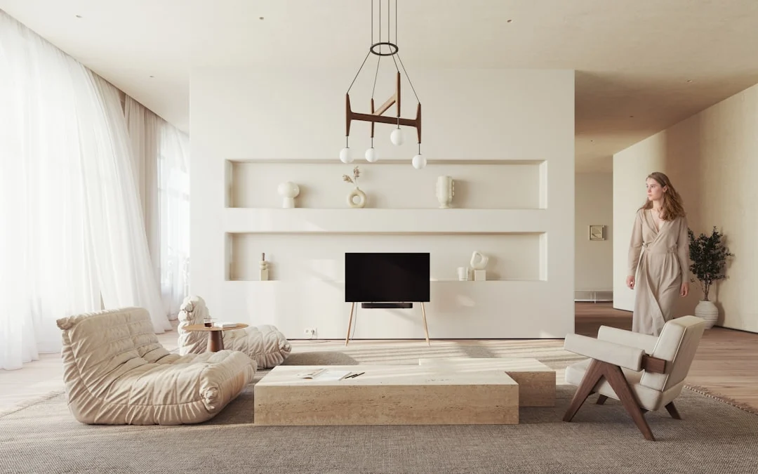
The 60-30-10 rule works here because it gives each tone a clear job:
- The dominant neutral covers roughly 60% of your space through walls and large surfaces
- Supporting neutrals take up about 30% in upholstery, rugs, and larger textiles
- The third tone makes up the remaining 10% through smaller accents like throw pillows, artwork, or ceramics
The trick is making sure these aren’t just different paint swatches from the same strip. They need to feel intentional rather than accidental.
Using Texture to Separate Similar Shades
A linen sofa in warm beige reads completely differently from a wool rug in cream even when the colors are close, because texture changes how light interacts with the surface. Matte paint on walls can make a room feel flat while glossier finishes create subtle contrast. Rough-hewn wood, brushed metal, and smooth ceramics each carry their own neutral tone into the mix without adding a new color.
Texture is your secret weapon for separating similar shades that would otherwise blend together visually.
Common Layering Mistakes That Make Rooms Look Flat
The most common mistake is choosing all three tones from the same palette — like picking beige, cream, and gray all with a warm undertone — because they end up competing for attention rather than supporting each other. Another trap is letting your dominant neutral swallow the room entirely, leaving no contrast between walls and large furniture pieces.
Small spaces often suffer from this problem more than large rooms because there’s less surface area to absorb color differences. When every wall, sofa, and rug reads as approximately the same shade, the eye has nowhere to rest.
How to Pick a Dominant Neutral and Two Supporting Tones
Look at your existing flooring and wood tones first — these are already in the room whether you like them or not. Oak floors tend to lean warm; slate and concrete tend to be cool. Choose your dominant neutral to either harmonize with or contrast against what’s on your floor, depending on the mood you want.
Then consider the lighting. North-facing rooms benefit from warmer neutrals that compensate for cool daylight, while south-facing rooms can handle cooler tones without feeling sterile. A practical test: paint a large swatch of your dominant neutral on the wall closest to your main light source and observe it at different times of day before committing.
Once you’ve locked in your base tone, pick two supporting neutrals that differ enough from it to create contrast but not so much that they feel disconnected. If your walls are a warm cream, try a cool gray sofa with a beige wool rug — the temperature difference between pieces does the heavy lifting instead of relying solely on color variation.
Bringing Earth Tones Into Neutral Rooms for Depth
A neutral room full of beige walls, a cream sofa, and gray pillows often looks like it’s holding its breath. The palette is quiet but also flat — there’s no visual anchor to tell the eye where to rest. Earth tones are what give neutrals their backbone. Colors like terracotta, olive, clay, and warm sand add warmth without pushing a room into full-on warm territory, and they do it in a way that feels intentional rather than decorative afterthought.
Why earth tones prevent sterile neutrals
The problem with pure neutrals isn’t that they’re boring — it’s that most people treat them as a single layer. When your walls, furniture, and textiles all live in the same temperature family at similar values, you get what designers call “value compression.” The room looks cohesive but also one-dimensional. Earth tones interrupt that compression by introducing mid-range saturation without shouting for attention.
Take terracotta, for example. It sits between warm red and neutral beige with just enough pigment to create contrast against a cream sofa or light oak floor. Olive works the same way — it’s green, but not the kind of green that feels like you’ve painted your room in a nursery. These tones are earth-toned precisely because they mimic what’s already in most homes: wood, stone, clay, and linen. That’s why they feel natural rather than decorative.
If your neutral palette feels sterile, add one or two earth tone pieces before you repaint. A terracotta vase on a cream console, an olive throw on a gray chair, or clay-colored ceramic planters near a beige sofa — these small interventions tell the room to breathe differently without requiring a full overhaul.
Where to introduce earth tones: accents vs. statement walls
You can bring earth tones into a neutral room two main ways, and each has different trade-offs depending on your space and lighting.
- Accent approach: Add terracotta, olive, or clay through textiles, ceramics, artwork, or a single piece of furniture. This is the safest route for renters or anyone unsure about committing to a deeper color. It also lets you adjust the balance seasonally — swap an olive pillow for a warm sand throw when the light changes.
- Statement wall: Paint one wall in a rich earth tone like burnt sienna, deep sage, or a clay red. This works especially well in rooms with good natural light because the pigment reads differently depending on the time of day. A west-facing room will make terracotta look almost orange by late afternoon; a north-facing room keeps it more muted and sophisticated.
For smaller rooms, the accent approach usually wins. Earth tone walls can overwhelm when the space is under 120 square feet unless you pick a lighter version — think sage instead of olive, or warm sand instead of clay. For open-plan spaces, painting one wall in an earth tone creates visual separation between living and dining areas without using furniture or rugs to do the work.
How earth tones bridge warm and cool neutrals in one room
This is where earth tones earn their keep. Most homes have a mix of warm and cool elements: oak floors (warm), gray tile bathrooms connected by hallways, stainless steel appliances, cool white ceilings. When you try to layer beige and gray together without an earth tone present, they tend to compete rather than cooperate.
Earth tones sit in the middle. Terracotta reads warm against a cool gray wall but doesn’t clash with it — it softens the contrast. Olive works with both cream and taupe because green is naturally neutral-adjacent. Clay connects beige walls to wood floors by echoing the undertones in the timber.
The practical result is that earth tones let you keep your warm neutrals (beige, cream, warm white) alongside your cool neutrals (gray, greige, off-white) without deciding which temperature family owns the room. You’re not choosing between warm and cool anymore — you’re building a palette around something in between.
If you’re planning a room refresh and haven’t picked paint yet, consider earth tones as your first anchor rather than an afterthought. Start with one or two pieces in terracotta or olive, see how they interact with your existing flooring and lighting, then choose your wall color based on what those pieces need — not the other way around.
Accent Walls That Work in Small Neutral Rooms (Without Shrinking Them)
The instinct to paint one wall a deeper shade often backfires in compact spaces, turning what should be an accent into a visual wall. A small room doesn’t need more contrast—it needs the right kind of contrast, placed where it can add depth rather than carve up the floor plan. The trick is treating the accent as a tonal shift within your neutral palette, not a departure from it.
When an accent wall helps vs. when it overwhelms
An accent wall pays off when there’s already enough visual activity in the room to support it. A living room with built-in shelving, a sofa, and layered textiles can handle a slightly darker wall behind the seating without feeling heavy. The same wall color will flatten out in a sparsely furnished bedroom where nothing competes for attention.
Three signals that your accent wall is working:
- The focal point of the room (fireplace, window wall, or bed headboard) aligns with the painted surface
- The darker tone reads as a step deeper in the palette rather than a different color family entirely
- The eye moves naturally from accent to adjacent walls without stopping at the corner like it’s hitting a boundary
It overwhelms when the painted wall sits opposite your main sightline, when it creates a boxy frame around furniture that should feel open, or when it introduces a warm tone into a cool-dominant room (or vice versa) without a bridge like wood flooring or textiles to reconcile them.
Choosing a slightly darker neutral for the feature wall
The most reliable move is picking a paint that sits two to three shades deeper on your chosen palette’s ladder. If your walls are Benjamin Moore Revere Pewter, try its next step down in the same family rather than jumping to a contrasting gray or taupe. Farrow & Ball does this well—Purbeck Stone layered against Setting Plaster gives you an accent that reads as richer without changing character.
Consider what you’re trying to achieve with depth:
- Cohesion-first approach: Keep the undertone identical (warm or cool) and only shift value. This is safest in small rooms where lighting already complicates perception.
- Tonal contrast approach: Introduce a slightly different undertone—cream on one wall, warm taupe on another—while keeping saturation low enough that the room doesn’t fracture into competing neutrals.
- Material bridge approach: Use wood tones in flooring or furniture to anchor whichever neutral feels most distant from your main walls.
Avoid going darker than a medium gray on north-facing walls, where cool light already pushes everything toward blue. A warm neutral like Benjamin Moore Cloud White will hold its ground better there than Sherwin-Williams Agreeable Gray, which can read almost lavender in the right (or wrong) light.
Matching accent walls to flooring and wood tones
Flooring is the reason most accent wall decisions fail. A warm-toned oak floor sitting against a cool gray accent wall creates a split personality problem—neither tone feels intentional, just mismatched. The solution isn’t to repaint the floor or change your accent color entirely; it’s to build a bridge with textiles and wood accents that share undertones with both.
Here’s how to read your existing wood tones against potential neutral choices:
- Light oak or maple: Pairs naturally with warm neutrals—beige, cream, taupe, soft whites like Farrow & Ball School House White. If you want a cool accent wall here, introduce a warmer rug or throw to keep the floor from feeling disconnected.
- Darker walnut or cherry: Handles cooler grays and blue-grays better. A Sherwin-Williams Naval or Benjamin Moore Kendall Charcoal can read rich rather than heavy when set against dark wood trim and flooring.
- Wide-plank white oak: The most versatile base for layering warm, cool, and earth-tone neutrals together because the pale undertone doesn’t pull strongly in either direction.
Paint a small swatch on your accent wall and observe it at different times of day. If the wood tones read warmer in morning light and cooler in afternoon, choose an accent neutral that sits between those extremes rather than committing to whichever side feels strongest at a single moment. That middle ground is where layered neutrals actually live.
Should You Choose Paint First or Furniture First?
Why paint-first decisions often clash with existing floors
Picking a neutral tone for your walls before looking at the furniture in the room is one of the most common mistakes people make. The problem is rarely that beige and cream don’t work together — it’s that they don’t work with the existing floor, door trim, or built-in wood tones you haven’t changed yet.
Sherwin-Williams popular warm neutrals like Alabaster and Swiss Coffee lean toward yellow undertones. Benjamin Moore’s White Dove has a subtle creaminess that reads as slightly warm. These shades look beautiful in samples on their cards, but once they hit a room with oak flooring or honey-colored trim, the warmth can compound until walls start to feel yellow instead of neutral.
The reverse happens with cool neutrals. A gray-based paint like Benjamin Moore’s Revere Pewter will look crisp against white trim and hardwood, but in rooms with natural light that leans warm (south-facing windows, incandescent bulbs), it can read as muddy or dull by late afternoon.
When furniture-first works better
A furniture-first approach makes more sense when your room already contains pieces you’re keeping — especially in rental properties, starter homes, or spaces where replacing sofas, chairs, or cabinets is impractical. In these cases, the wood tones and fabric colors of existing furniture become your palette anchors.
If you have a walnut coffee table, gray linen sofa, and black metal lighting fixtures, your paint needs to bridge those three elements rather than compete with them. Start by swatching paint against your largest furniture piece first, then test it against the floor in the actual room light at different times of day.
This method also works well when you’re dealing with mixed wood tones — a common situation in older homes where oak trim meets maple cabinets and cherry flooring all exist in one open-plan space. A furniture-first approach gives you a clearer reference point for choosing between warm, cool, and earth tone room ideas.
A practical decision framework based on your room’s constraints
Deciding whether to paint first or choose furniture first comes down to three questions about your space:
- What stays? If you’re keeping flooring, trim, and most furniture, let those elements dictate your neutral palette and pick paint afterward.
- What changes? If you’re replacing the sofa and curtains but keeping floors, start with the new furniture to establish warm vs cool undertones, then paint to match.
- What’s the lighting like? Rooms with north-facing windows or lots of artificial light tend toward cooler neutrals. South-facing rooms handle warm tones better. Check your existing light bulbs — a 2700K bulb makes everything look warmer than a 3000K LED.
If you’re painting a small room and want it to feel larger, cool neutral color scheme options like soft gray or blue-gray tend to recede visually. But make sure the undertones don’t clash with your wood furniture — otherwise you’ll end up with beige vs cream wall color confusion that makes the whole space look disjointed.
The safest approach for most people: buy one large paint sample, test it on both a north and south wall in your room, then compare that swatch against your existing furniture before committing to full coverage.
End with a specific, decision-oriented call-to-action: encourage readers to take photos of their room at different times of day and compare how warm and cool neutrals shift under natural light before committing to paint. Offer a free downloadable checklist ("Warm vs Cool Neutral Room Checklist") that walks them through the 4-step layering process covered in the article.
Related posts:




Tagged: Beige Vs Cream Wall Color, Cool Neutral Color Scheme, Home Decor, Layering Neutrals In A Room, Neutral Room Palette Ideas, Neutral Tone Room Decor, Neutral Tones For Living Room, Warm Neutral Decor