

Industrial Home Design Without the Cold Warehouse Feel: A Practical Guide

Opening with the tension that defines industrial design—raw, masculine aesthetics often read as sterile or overly stark—and setting up the article's promise: achieving that coveted loft aesthetic while keeping spaces warm, layered, and genuinely livable for everyday family life.
Layering Warmth Into Industrial Spaces Without Losing the Edge
Industrial home design often gets a bad reputation for feeling like you’ve moved into a converted warehouse in January. The raw materials that give the style its character—exposed brick, concrete floors, steel accents—are also the same elements that can make a room feel sterile if left unlayered. The trick isn’t to hide those features but to build warmth around them so your space reads as intentionally curated rather than unfurnished.

Textile Layering: Rugs, Throws, and Cushions That Counter Hard Surfaces
The first line of defense against the cold warehouse effect is textiles, but not just any textiles. A thin cotton throw over a leather sofa might look nice in a magazine photo; it won’t survive a family evening. Look for materials with substance—chunky wool rugs layered under dining tables, velvet cushions on metal-framed chairs, heavy linen curtains that absorb sound and add visual weight.
Start by identifying your hardest surfaces. If your living room has concrete floors, skip the light jute rug in favor of a thick, high-pile option in an earthy tone. Position it so feet naturally land on softness rather than stone when you walk through the space. The goal is tactile contrast: hard meets soft in predictable places.
Warm Wood Tones Against Cool Concrete and Metal
Wood is the most effective counterweight to industrial metal and concrete, but the type of wood matters significantly. Reclaimed oak with visible grain patterns adds organic warmth that feels lived-in rather than decorative. Dark walnut tones create a moody, sophisticated contrast against white-painted brick walls, while lighter maple or ash keeps spaces feeling open—important in smaller rooms.

Consider the furniture pieces you’ll keep longest. A solid wood dining table will anchor an industrial kitchen better than a glass-topped one ever could. Pair it with metal-framed chairs to maintain that raw edge without sacrificing warmth at the meal. The same principle applies to shelving: open wooden shelves against exposed brick read as intentional, while metal-only shelving can tip toward warehouse.
The 60-30-10 Rule for Industrial Color Palettes
Color distribution prevents industrial spaces from feeling either too dark or too washed out. In this framework, sixty percent of your palette should be a dominant neutral—think warm whites, soft grays, or muted taupes. Thirty percent is the secondary color, often drawn from wood tones or deeper metallics like oil-rubbed bronze. The remaining ten percent is your accent, where you introduce warmth through textiles, artwork, or small decor pieces in terracotta, mustard, or burnt orange.
Apply this rule room by room rather than across the entire house. A bedroom might lean toward sixty percent warm gray with thirty percent natural wood and ten percent deep navy accents. Your industrial kitchen could flip those proportions: sixty percent white-painted cabinetry, thirty percent exposed metal fixtures, and ten percent terracotta tile or wooden cutting boards displayed on open shelves.
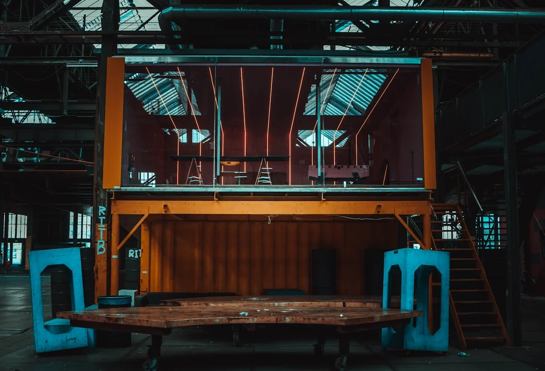
One practical test: if you close your eyes in a room and can’t tell whether it’s winter or summer outside based on the feeling alone, you probably need more warmth. If the space feels like a museum, you’ve gone too far. Industrial home design at its best sits somewhere between—recognizable as raw and honest, but undeniably comfortable.
Exposed Brick vs. Painted Walls: Which Reads Industrial Without Reading Cold?
The word “industrial” conjures two very different images. One is a converted warehouse with raw brick, visible pipes, and polished concrete—stunning but occasionally austere. The other is the same aesthetic softened by layered textiles, warm lighting, and furniture that feels lived-in rather than factory-fresh. Your wall treatment often determines which version your space reads as.
When Exposed Brick Works Best (and When It Overwhelms)
Exposed brick delivers immediate industrial credibility. The texture catches light differently than smooth surfaces, and the natural variations in color give a room depth that paint alone struggles to achieve. But brick is heavy material—both literally and visually—and it demands balance.
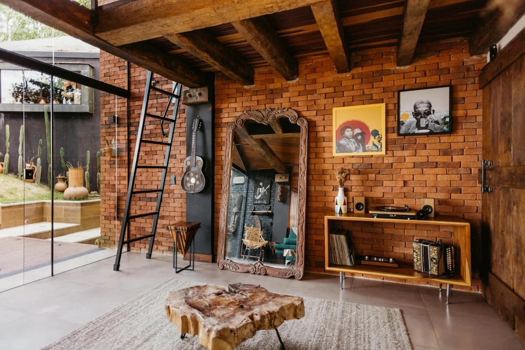
Exposed brick works best as an accent wall rather than a full-room treatment. A single feature wall behind a sofa or bed anchors the industrial feel without turning the space into a museum piece. The rest of your room can then carry softer elements: woven textiles, warm wood tones, layered rugs.
The problem arises when you commit to brick in rooms that already have competing textures—think shiplap ceilings, exposed beams, and metal light fixtures all fighting for attention. In those cases, one element should take the lead while others recede. If your brick is doing the heavy lifting visually, keep your ceiling clean and your lighting fixture simple rather than ornate.
Brick also interacts differently with natural light depending on orientation. South-facing rooms with exposed brick can feel warm and inviting by midday but may darken considerably in winter months when the sun angle drops. North-facing rooms benefit from painting that same brick, which brightens the space while retaining some texture.
Painting Brick in Warm Whites Versus Stark Grays
Painted brick doesn’t erase the industrial character—it refines it. The key is choosing a tone that complements rather than competes with your other materials. A warm white paint (think Benjamin Moore’s Swiss Coffee or Sherwin-Williams Alabaster) keeps the warmth in the room while giving the brick a more finished appearance. This approach works particularly well in spaces where you want industrial bones without the loft-apartment edge.
Stark grays—especially cool, blue-leaning ones like Benjamin Moore’s Revere Pewter or Sherwin-Williams Accessible Gray—lean harder into the industrial aesthetic. They pair naturally with matte black fixtures, metal accents, and concrete floors. The trade-off is that gray walls can feel colder in rooms without sufficient lighting or textile layering.
Here’s a practical test: paint a large sample board on your brick wall and observe it at different times of day. Morning light tends to warm up both whites and grays, while evening artificial light reveals how cool or warm the underlying tone truly is. If you find yourself drawn to the gray in afternoon light but worried about winter evenings, consider a mid-tone that bridges the gap—something like Farrow & Ball’s Setting Plaster.
Budget Trade-Off: Faux Brick Panels vs. Real Masonry
Real brick is expensive to install and requires structural consideration if you’re removing existing wall finishes. A full exposed brick installation in a new build or renovation typically runs $15 to $25 per square foot, depending on whether the brick is being laid fresh or salvaged from demolition. It’s a long-term investment that adds genuine value.
Faux brick panels—thin slices of real brick or high-quality PVC composites—run between $3 and $8 per square foot for materials alone. They’re easier to install (often as a DIY project), lighter on existing walls, and removable without major damage. The visual difference is subtle in person but noticeable from across the room, particularly in how light catches the texture.
If you’re renting or planning to move within a few years, faux panels may be the smarter choice. They deliver the industrial aesthetic without permanent commitment. If you own your home long-term and want a feature that ages gracefully, real brick earns its keep through genuine character that develops over time.
Lighting That Defines Industrial Style (Without the Dark Loft Effect)
Industrial home design often gets a reputation for feeling like you moved into a converted warehouse on purpose—and not in the good way. The problem usually isn’t exposed brick or raw metal; it’s lighting that was never given second thought. A single overhead bulb, recessed can lights scattered randomly, or oversized pendants hung too low creates shadows where they shouldn’t be and leaves surfaces flat.
The fix starts with understanding that industrial lighting works best when it does more than illuminate—it frames the space.
Edison bulbs and pendant lighting: placement matters more than style
Anyone who’s walked into an industrial-style café knows the Edison bulb. The exposed filament, warm amber glow, and vintage character feel right at home among reclaimed wood and steel accents. But here’s where most homeowners get it wrong: they buy the bulbs themselves without thinking about placement.
A single pendant hung over a kitchen island works beautifully at 28 to 30 inches above the surface. The same fixture placed six inches lower feels cramped; six inches higher and the light spreads too thin, losing that intimate glow. For dining areas, aim for 30 to 34 inches above the table. These numbers aren’t rigid rules—they’re starting points. Your ceiling height, furniture scale, and personal preference will shift them up or down.
When mixing multiple pendants, space them evenly but leave room between each one. Three fixtures over a six-foot island should sit roughly 18 inches apart. The bulbs themselves—whether vintage-style Edison or modern LED equivalents that mimic the look—should be positioned to cast light downward and outward, not just straight down like a spotlight.
Layering ambient, task, and accent light in industrial spaces
The dark loft effect happens when you rely on one type of lighting for everything. Industrial home design benefits from layering because the exposed elements—ductwork, beams, unfinished walls—create visual weight that needs balancing.
Ambient lighting forms your base layer. Recessed LED strips along ceiling edges, track lighting aimed at artwork or architectural features, or a central fixture with diffused bulbs set the overall mood. Task lighting addresses specific functions: under-cabinet LEDs in kitchens, adjustable desk lamps in home offices, focused reading lights beside seating areas. Accent lighting brings character to the design—wall sconces highlighting exposed brick, directional spotlights on metal accent pieces, or even small floor lamps placed strategically near corners.
The key is distributing these layers so no single fixture carries too much load. A living room with only recessed lights and one overhead lamp will feel sterile despite its industrial materials. Add a table lamp near the sofa, a directional light on a bookshelf, and you’ve created depth that makes the space feel lived-in rather than staged.
Why matte black fixtures outperform polished metal for warmth
Polished chrome and brushed nickel have their place in industrial design, but they tend to reflect light—and themselves—which can make a room feel cooler. Matte black fixtures absorb light instead of bouncing it around, creating the visual weight that grounds an industrial space without adding harshness.
This isn’t about choosing one over the other entirely. A matte black floor lamp beside a polished metal side table creates contrast that feels intentional rather than accidental. The trick is using matte finishes as your primary anchors and letting reflective metals serve as accents. Think of it this way: matte black reads as warm industrial, while polished metal reads as cool industrial.
Consider the practical side too. Matte black fixtures show fingerprints less than their polished counterparts, which matters in high-traffic areas. They also tend to age gracefully—minor scratches and wear blend in rather than standing out like they would on a shiny surface.
Industrial Furniture That Works for Small Spaces and Family Living
Industrial design has a reputation for feeling like it belongs in a converted warehouse—exposed brick, steel beams, concrete floors, and metal everywhere. But there is nothing about the aesthetic that requires sacrificing comfort or warmth. The trick lies in choosing pieces that do real work in your home instead of merely looking industrial.
Reclaimed Wood Dining Tables: Statement Pieces That Anchor a Room
A solid reclaimed wood dining table can be the single most effective way to warm up an industrial-feeling space. The raw edges, visible joinery, and natural grain patterns give you that character without the coldness of polished marble or glass. Look for tables made from actual barn wood, old flooring, or salvaged beams—these pieces carry genuine history rather than just a weathered finish.
For smaller dining areas, consider a table with a live edge and slender metal legs. The visual weight of the wood top grounds the room while the thin legs keep sightlines clear enough that the space does not feel cramped. Pair it with upholstered chairs in warm tones like olive green or rust to soften what could otherwise read as a utilitarian setup.
Metal-Framed Sofas and Ottomans for Visual Lightness
Heavy furniture kills the airy feeling of industrial design. Metal-framed sofas, particularly those with slender profiles and exposed legs, let you see more floor space and create a sense that the room breathes. Look for frames in brushed brass, matte black steel, or wrought iron rather than shiny chrome, which can lean toward commercial spaces.
When selecting metal furniture for family living, consider how pieces will hold up to daily use. A sofa with a powder-coated frame resists scratches better than painted finishes. Ottomans in leather or durable woven textiles add layers of warmth and texture that counterbalance the industrial materials around them. The goal is not to pile on softness but to place it strategically.
Open Shelving Ideas That Showcase Industrial Character Without Clutter
Industrial open shelving works best when you think of it as curated display rather than storage overflow. Metal pipe and wood combinations, or steel brackets against painted walls, give you that loft feel without the warehouse look. The key decision point is how much surface area you leave exposed versus filled.
A practical approach: dedicate one wall to open shelving in a living room or family room, leaving the other surfaces more contained. Fill shelves with a mix of items—ceramics, books, plants, and maybe one or two pieces of industrial decor like vintage tools or metal containers—but leave breathing room between groups. Overfilled shelves read as cluttered; too sparse, and the space feels unfinished.
Consider shelving height and accessibility if you have young children or elderly family members. Eye-level shelves for display pieces, lower ones for everyday use. Industrial design should work for how people actually live in a space, not just how it photographs.
Industrial vs. Scandinavian: Why Mixing Them Creates the Best of Both Worlds
The most striking industrial homes are rarely pure expressions of one style. They pull from somewhere in between, and that middle ground is where most homeowners land when they want raw materials without the starkness.
Key differences in material palette and warmth level
Industrial design leans on concrete, exposed brick, steel, and dark metals. scandinavian design favors pale woods like ash and oak, white walls, and lighter textiles. The gap between them isn’t about quality or taste — it’s about temperature.
When you strip a house down to its industrial bones, the result can feel like a converted warehouse on a winter morning. Scandinavian touches warm that up without softening the structure: a wool throw over a leather sofa, light-colored oak flooring under black metal accents, linen curtains against a brick wall.
When to lean industrial and when to soften with Scandinavian touches
Start by looking at your space’s natural light. North-facing rooms or ones with limited windows will feel heavier if you load them up on dark industrial materials. In those cases, keep the brick and metal but introduce lighter woods, white walls, and layered textiles early in the design process.
South-facing spaces that already get strong daylight can handle more of the industrial weight — think exposed ductwork, Edison bulbs, matte black fixtures, and concrete floors without feeling cavernous. The sun does a lot of the warming work for you.
Real-world examples of successful hybrid spaces
A Brooklyn loft owner might pair reclaimed wood dining tables with an industrial pipe shelving unit holding Scandinavian ceramics — the contrast feels intentional rather than accidental. In a converted warehouse apartment, white-washed brick walls and light oak floors ground the space while black metal window frames and exposed concrete ceilings anchor it in industrial territory.
One practical rule of thumb: choose your dominant material first (the one that covers the most surface area), then pick secondary elements from the other style. If you’ve gone with exposed brick walls as your anchor, introduce Scandinavian warm tones through textiles and wood finishes rather than fighting against them with more dark metal and concrete.
The result is a space that reads as industrial at first glance but invites you in — exactly what most homeowners want when they say they’re going for an “industrial home design” look without the cold warehouse feel.
Start with one warm material—like a vintage rug or a reclaimed wood shelf—and build from there, rather than trying to get every industrial element right at once.
Related posts:


Tagged: Concrete Floors Home, Edison Bulb Lighting, Exposed Brick Walls, Home Decor, Industrial Home Design, Industrial Interior Design, Metal Accents Decor, Reclaimed Wood Furniture