

Bathroom Wall Art That Survives Moisture and Matches Your Fixtures

Briefly establish why bathroom wall art is fundamentally different from other rooms—humidity, steam cycles, and the need to coordinate with existing tile, faucet finish, and cabinet tone—and signal that this guide focuses on material durability and fixture matching rather than just aesthetics.
Moisture-Proof Your Wall Art: Material Choices That Actually Hold Up
The bathroom is one of the most unforgiving rooms for wall art. Every hot shower sends a wave of steam upward, and that humidity doesn’t disappear when you turn off the water—it lingers, sometimes for hours. Standard prints and canvases absorb that moisture into their fibers and backing, which is why you’ve probably seen artwork curl at the edges or develop a faint haze after just a few months in a secondary bathroom.
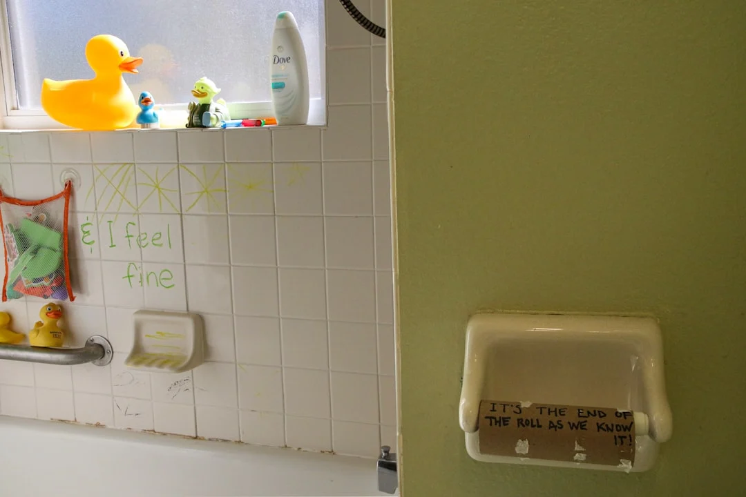
Acrylic vs. Sealed Canvas Prints — Which Survives Steam Cycles Better
Acrylic prints are essentially ink bonded directly to a sheet of acrylic, which means there’s no paper or canvas layer between your image and the moisture in the air. The result is a piece that won’t warp, fade, or develop mold even when hung above a showerhead or in an ensuite without a window. Sealed canvas prints offer a middle ground: they use real fabric texture with a protective coating that handles humidity well enough for most bathrooms, though not as reliably as acrylic under heavy steam conditions.
Here’s what to consider when choosing between them. Acrylic is heavier and more expensive per square foot, but it’s virtually indestructible in humid environments. Sealed canvas looks warmer and softer, which works well if your bathroom has a spa-like or organic aesthetic. If you’re placing artwork directly across from the shower or in an open-concept bathroom where steam travels freely, lean toward acrylic. A sealed canvas is perfectly fine in a powder room or half-bath with minimal moisture exposure.
Metal and Aluminum Frames That Resist Warping Without Heavy Maintenance
Wood frames look beautiful but absorb moisture over time, which causes them to expand and contract — sometimes enough to crack the mat board or push the print out of alignment. Metal frames, particularly aluminum, don’t have this problem. They stay dimensionally stable even when humidity fluctuates throughout the day.
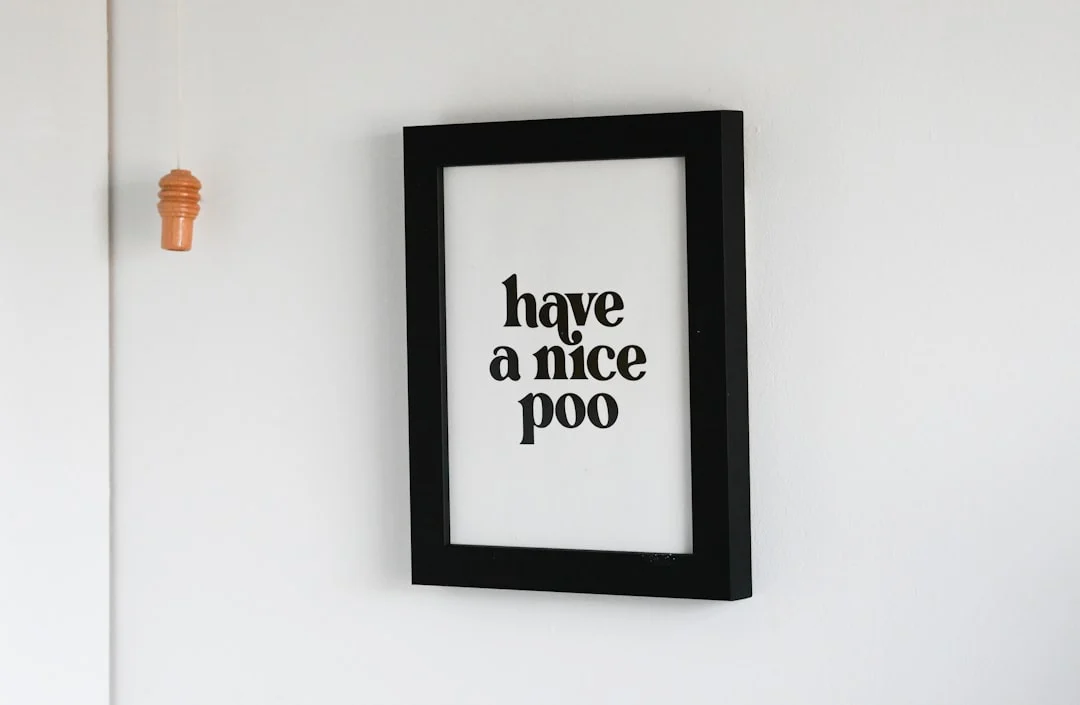
The key is choosing the right metal finish to match your fixtures. Brushed nickel frames pair naturally with brushed nickel faucets and towel bars without looking like a mismatched set. Chrome works well with polished nickel or stainless steel elements. Matte black aluminum frames are increasingly popular for modern bathrooms and coordinate easily with black faucet handles, showerheads, and cabinet hardware.
One thing to keep in mind: metal frames add very little visual weight compared to wood. If you have a large piece of wall art above the toilet or vanity, a thin metal frame might make the artwork feel smaller than it actually is. In that case, consider going with a wider metal frame profile or a sealed canvas without any frame at all.
The Trade-Off of Standard Unsealed Prints in Bathrooms Over Time
Most people buy standard prints — unsealed paper mounted behind glass — because they’re affordable and come in every design imaginable. The problem is that over time, the moisture in your bathroom will eventually find its way into those prints. You’ll notice it first at the edges where the paper meets the mat board. After a year or two in a humid bathroom, you might see slight warping, discoloration along the borders, or even tiny spots of mold if the print is behind glass that doesn’t breathe.
This doesn’t mean standard prints are bad for bathrooms — it just means they need more careful placement. If your bathroom has good ventilation, a window, or an exhaust fan that runs during and after showers, a standard print behind glass can last for years without issues. The real problem occurs in bathrooms with poor airflow, where steam stays trapped against the walls long after you’ve finished getting ready.
Before buying any wall art for your bathroom, check whether it’s labeled as moisture-resistant or sealed. If it isn’t, consider adding a waterproofing spray or upgrading to acrylic framing — both are relatively inexpensive ways to protect standard prints from humidity damage.
Size Rules for Common Bathroom Zones (Not One-Size-Fits-All)
The size of your bathroom wall art should respond to the zone it’s in, not just the square footage of the room. A print that looks balanced above a toilet will feel lost over a vanity, while something appropriate for one area might overwhelm another. The key is treating each zone as its own composition.
Above the toilet: narrow formats that don’t overwhelm a small wall
Toilet walls are usually 18 to 24 inches wide between the tank and the side wall, or wider if you have a freestanding unit. A single large print here can dominate the space, which is why many bathroom art enthusiasts prefer narrower formats — think 16 by 20 inches or vertical compositions in the 12 by 36 inch range.
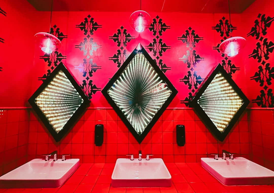
For small bathrooms, a trio of prints works better than one oversized piece. Three identical frames in 8 by 10 inches, spaced evenly with about two inches between them, create visual rhythm without competing with the toilet’s bulk below. If your toilet wall is wider — say above a modern elongated model with open space on either side — a single horizontal print of 24 by 36 inches can anchor the area nicely.
One practical consideration: if you’re mounting artwork directly over the tank, leave at least four to six inches of clearance from the top. This prevents water splashes and steam from reaching the frame edge, especially with moisture resistant wall art that uses sealed canvas or acrylic rather than paper prints in standard wood frames.
Over the vanity: balancing width with mirror and cabinet proportions
Vanity walls present a different sizing challenge because you’re coordinating artwork with both the mirror and the cabinets below. A common mistake is hanging art that’s narrower than the mirror, which makes the wall feel top-heavy.
The rule of thumb: your vanity art should be about two-thirds to three-quarters the width of the mirror above it. If your mirror is 36 inches wide, aim for artwork between 24 and 30 inches across. For a single print, this means selecting something in the 24 by 36 inch range or similar proportions. For larger vanities with wider mirrors — say 48 inches — you might choose a piece that spans 32 to 36 inches wide.
When matching bathroom wall art to tile color, measure from the countertop up. Most vanity backsplashes sit between 4 and 6 inches above the counter, so your artwork should start roughly 6 to 8 inches above the countertop surface. This prevents the visual competition between patterned tile and busy prints.
Modern bathroom wall art often benefits from a wider format here — think landscape-oriented pieces in 30 by 20 inch proportions — because vanity mirrors tend to be rectangular and horizontal. If you’re working with a tall, narrow mirror instead, switch to vertical artwork that echoes that shape rather than fighting against it.
Near the tub or shower: how proximity to wet zones changes sizing
Wall art near the tub or shower faces two sizing decisions: what dimension works for the wall, and whether the material can handle humidity. Proximity matters more than you’d think — a print hung 12 inches from a shower door experiences significantly more steam than one at 36 inches.
For waterproof framed prints within six feet of a shower or tub, lean toward larger formats. A single piece in the 24 by 36 inch range or bigger fills the wall without looking crowded, and larger surface areas tend to handle humidity better than smaller, more detailed prints that trap moisture between layers.
Consider acrylic framed bathroom artwork for wet zones specifically. Acrylic doesn’t warp like wood frames can, and sealed canvas prints resist curling at the edges — a common problem with standard paper-based prints in humid bathrooms. Metal-framed pieces offer another durable option, especially for modern bathroom wall art that coordinates with chrome or brushed nickel fixtures.
If your tub wall is particularly narrow (think between 24 and 36 inches wide), a single vertical print works better than a horizontal one. For wider walls above soaking tubs — often 48 to 60 inches across — a large bathroom wall decor piece of at least 36 by 48 inches can serve as the room’s focal point without feeling lost in the space.
Regardless of the zone, always measure twice. A print that looks perfect online might be too wide for your actual wall once you account for the gap between fixtures and the edges of the artwork itself. The best bathroom art above toilet installations often starts with a simple tape outline on the wall — cut from cardboard or paper to the exact dimensions — and step back to see how it feels before committing to purchase.
Match Art to Fixtures Without Guesswork
Bathroom wall art looks intentional when it speaks the same visual language as your fixtures. That doesn’t mean every piece needs to match perfectly — it means creating a thread that ties your faucet, tile, and cabinetry together so the room feels coordinated rather than assembled from separate decisions.
Faucet Finish Coordination
Your faucet finish sets a tone for the hardware in the room, and wall art can either reinforce or contrast it depending on how you read the colors. Chrome reflects light sharply and pairs naturally with cool-toned prints — think blues, grays, whites, and silvers. Brushed nickel has a warmer undertone that works well with beige, taupe, and soft green palettes. Matte black creates strong visual anchors and stands up nicely to bolder artwork, especially pieces with black framing or dark accents.
Here’s the practical move: take a small sample of your fixture finish — a spoon handle for chrome, a towel ring for brushed nickel, a cabinet pull for matte black — and hold it next to potential artwork. If the print reads as part of the same family rather than competing with it, you have a winner.
Tile Color Matching
Tile is often the largest surface in a bathroom, which means its color carries more visual weight than most homeowners realize. Instead of trying to match your art directly to the tile — which can look forced — pull a secondary or accent color from the grout lines, pattern details, or decorative strips and use that as your guide.
For example, if you have white subway tile with gray grout, your artwork doesn’t need to be gray. It needs to include gray somewhere — in a frame, an accent stripe, or even the wall behind it. The same principle works for colored tiles: navy herringbone pulls beautifully from dark blues and whites; terracotta floor tiles echo through warm ochres and rusts in your prints.
If your tile has strong patterns, like geometric mosaics or bold botanical prints, lean toward simpler artwork so the two don’t compete. When your tile is plain, you can afford more graphic pieces that add personality without creating visual noise.
Cabinet Tone as a Subtle Anchor
Cabinetry often goes overlooked when selecting bathroom wall art, but it’s one of the most reliable color guides in the room. Wood-toned cabinets — whether painted white, stained oak, or finished in gray washes — establish a warm or cool base that your artwork can mirror.
For larger pieces above vanities or toilets, this is especially useful. A wood-framed print will feel connected to wooden cabinetry even if the colors aren’t identical. Painted cabinets give you more freedom since they act as a neutral canvas, but matching the undertone (warm whites with warm art, cool grays with cool art) prevents that subtle “off” feeling.
When choosing moisture resistant wall art for humid bathrooms, sealed canvas prints and acrylic-faced pieces tend to coordinate better with painted cabinets because they don’t introduce competing textures. Metal-framed artwork pairs naturally with hardware finishes and creates a modern look that feels intentional rather than accidental.
Placement Decisions That Affect Longevity
Where you hang bathroom wall art matters as much as what material you choose. A print that survives above a guest powder room may buckle within weeks in a master bath with daily showers.
Wet Zones and Steam Exposure — Where to Hang and Where to Avoid
The area directly adjacent to the shower or bathtub is the most demanding zone for wall art. Open showers without a door let steam travel farther, while enclosed tubs contain moisture more effectively but create concentrated humidity pockets. Art hung on walls within two feet of a showerhead will absorb significantly more moisture than pieces placed across the room.
Avoid placing standard paper-based prints or unsealed canvas directly above bathtubs where spray reaches during use. Instead, opt for waterproof framed prints with acrylic glazing or sealed metal panels in these positions. A metal print positioned above a vanity mirror typically survives longer than a traditional wood-framed piece because it lacks the organic materials that absorb moisture and expand.
For shower walls specifically, consider tile art or vinyl decals designed for direct water contact. These eliminate framing altogether and remove the weak point where moisture can seep between glass and frame edges over time.
Lighting Considerations for Artwork Near Mirrors and Vanities
Vanity lighting creates its own set of challenges. Bulbs positioned above mirrors cast downward light that highlights texture in artwork, which means canvas prints show more depth but also reveal imperfections more readily than flat surfaces. If your vanity bulbs are within six inches of the wall surface, they can gradually warm and dry out wood frames, causing warping.
LED strip lighting installed behind mirrors offers a gentler alternative for artworks placed nearby because LEDs generate minimal heat while providing even illumination across the entire piece. However, direct LED strips positioned close to artwork can cause color shifts over time, particularly with UV-sensitive pigments. Look for LED strips labeled as “UV stable” or choose prints on acrylic, which resists both heat and light degradation.
Consider the direction of your mirror’s reflection when selecting art placement. A piece hung directly opposite a window will receive natural light twice — once directly and once reflected — making it prone to faster fading unless you use UV-protective glazing. Darker-colored artworks actually fare better in these high-light positions because they absorb rather than reflect the UV rays.
How Bathroom Humidity Levels Vary by Room Size
Small bathrooms under 40 square feet can reach humidity levels above 80 percent during and after a shower, while larger bathrooms with higher ceilings maintain lower relative humidity because the same amount of steam disperses across more air volume. A bathroom with an exhaust fan rated for 50 CFM will reduce post-shower humidity by half within 15 minutes in most rooms.
The placement of your artwork relative to the exhaust fan matters. Pieces hung near ceiling-level fans experience less prolonged moisture exposure than those positioned at eye level or lower, where steam settles before being extracted. In bathrooms without a fan, consider hanging larger-format wall decor higher on the wall to take advantage of natural ventilation patterns.
Room size also affects which sizes work best. A 24×36 inch piece may look overwhelming in a tiny half bath but feel appropriately scaled in a master bathroom with a double vanity and soaking tub. As a general rule, artwork should occupy roughly one-third to one-half the width of the wall space it fills — whether that’s above a toilet, beside a mirror, or on an accent wall.
For bathrooms where humidity consistently exceeds 70 percent, sealed canvas prints with moisture-resistant backing outperform unsealed alternatives by at least two years. Metal prints maintain their appearance indefinitely regardless of humidity because they contain no organic materials to absorb water. Acrylic facemounted prints offer the best combination of visual clarity and moisture protection for high-humidity environments.
Common Mistakes When Shopping for Bathroom Art Online
Bathroom wall art looks deceptively simple. The problem is that most shoppers treat it like any other decorative purchase, overlooking the conditions a humid room imposes on frames, prints, and canvases. Below are the mistakes that send buyers back to the drawing board.
Overlooking Frame Material Specs in Favor of Visual Appeal Alone
A beautiful black-and-white photograph in an ornate gold frame reads as expensive on a product page, but “gold” can mean anything from brass-plated metal to painted wood. What matters for bathroom artwork ideas is what’s behind the finish.
- Wood frames need sealed edges and humidity-resistant coatings. Unsealed wood will swell in a steamy bathroom, especially above showers or near bathtubs.
- Metal frames (aluminum, stainless steel) are naturally moisture resistant, but check whether the backing board is also sealed. MDF backings absorb water like sponges.
- Acrylic glazing outperforms glass in bathrooms because it’s lighter and less prone to fogging from condensation.
If you’re buying waterproof framed prints or large bathroom wall decor online, look for the material specifications — not just the thumbnail image. Many listings say “waterproof” but only mean the print is sealed under acrylic. The frame itself may still be untreated pine.
Ignoring Scale — Pieces That Look Large on Screen But Feel Small on the Wall
Product photos are usually staged against plain walls with minimal context, making even modest prints look substantial. A 24×36 inch print appears to dominate a bathroom accent wall in the mockup, but in reality it might feel dwarfed above your vanity or toilet.
The rule of thumb for what size wall art for bathroom vanity setups: aim for artwork that spans roughly two-thirds to three-quarters of the width of the surface below it. If you have a 36-inch wide vanity, look for pieces totaling about 24 to 30 inches across. For bathroom art above toilet installations in smaller bathrooms, a single framed print or a trio of coordinated panels works better than one oversized piece that crowds the space.
Before you order, measure your wall with painter’s tape and live-size the dimensions. This simple step catches the most common sizing errors for modern bathroom wall art purchases.
Mismatching Art Style With Fixture Era
Your faucet finish — brushed nickel, matte black, polished brass, oil-rubbed bronze — sets a tone that your wall decor should echo. Similarly, tile color matching and cabinet tone create visual anchors that influence whether artwork feels intentional or like an afterthought.
- A sleek geometric print in a thin metal frame reads as contemporary. It will clash with vintage brass fixtures and subway tile from the 1920s–40s.
- Botanical illustrations on cream-colored paper pair naturally with antique-style cabinets and warm-toned tiles, even if your faucet is modern brushed nickel (which bridges both eras well).
- Above all, coordinate at least one element: frame metal should pick up the finish of your hardware, or the artwork color palette should echo dominant tones in your tile.
When people ask how to match bathroom wall art to tile color, start with the grout. It’s often overlooked but appears between every tile, creating a grid that can either complement or fight against the frame and print colors you choose.
What size wall art works above a bathroom vanity?
The width of your artwork should sit between 50% and 75% of the vanity’s total width. A 36-inch double-sink vanity typically accommodates two pieces at 18 to 24 inches each, or one wider piece around 30 inches. Above a single sink, aim for a single frame that doesn’t extend past the edges of the countertop on either side. If you’re working with limited wall space, vertical prints stacked in pairs create visual height without overwhelming the area.
Which framing materials actually survive bathroom humidity?
Acrylic faces and metal frames resist warping better than paper-mat boards or pressed wood. Sealed canvas works well if it’s wrapped around a moisture-resistant stretcher bar and has a protective coating on the front. Avoid unsealed prints behind glass unless the glass is set in a frame with a proper backing seal—moisture trapped inside the frame can fog the artwork over time. Metal frames in brushed nickel or chrome also echo popular faucet finishes, giving you both durability and visual coordination.
How do I match wall art to existing tile color?
Pull one or two colors from your tile pattern rather than trying to match everything. If your tiles are a busy mosaic with blue, green, and white, choose artwork that features those same tones—even if the piece is dominated by one of them. For solid-color tiles, let the art introduce contrast: dark tile pairs well with lighter framed pieces, while light tile benefits from deeper accent colors in the artwork. The goal is harmony, not a perfect color match.
Is wall art above the toilet worth it in small bathrooms?
It depends on your ceiling height and how much visual clutter you already have. Above the toilet works best when there’s at least 12 inches between the top of the tank and the bottom of the frame, leaving room for the piece to breathe. In compact powder rooms, a single narrow vertical print often reads better than a wide horizontal one because it draws the eye upward without competing with other fixtures.
Can I hang canvas prints in wet zones near the shower?
Canvas prints can handle bathroom humidity as long as they’re sealed and kept at least 6 feet from direct spray. If your shower is enclosed, most wall art stays safe even when hung closer to the water line. Unsealed canvas left exposed to steam will eventually develop a soft, slightly wrinkled texture that some homeowners find charming and others see as damage—decide whether you want crisp preservation or a relaxed look.
What’s the best way to coordinate artwork with faucet finish?
Match the metal tone of your frame—or at least one major element in it—to your faucets, towel bars, and shower fixtures for a unified appearance. Brushed nickel art pairs naturally with brushed nickel hardware; matte black frames complement oil-rubbed bronze or black faucets; brass-toned artwork works well with polished chrome when you’re going for contrast. You don’t need to match every metal piece exactly—just keep the finishes in the same family so the room reads as intentional rather than random.
Should I use waterproof prints or regular framed art?
Waterproof prints are worth the investment if your bathroom gets heavy steam from daily hot showers and you don’t have a functioning exhaust fan. They resist fading and warping over time without needing protective coatings. Regular framed art works fine in low-to-moderate humidity bathrooms, especially when the frame itself is sealed. The trade-off is that regular prints may need occasional replacement or re-framing after several years of exposure.
How do I decide between one large piece and a gallery wall?
A single large piece creates a focal point and works well above vanities, bathtubs, or against accent walls where you want the art to stand alone. Gallery walls suit longer stretches of wall space—like above a row of cabinets or along a hallway—and allow you to mix materials, sizes, and colors for visual interest. If your bathroom is already busy with patterned tile, wallpaper, or textured fixtures, one large piece often prevents overwhelm.
End with a practical next step — e.g., 'Download our bathroom wall art sizing cheat sheet' or 'Shop moisture-resistant, fixture-matched pieces in curated sets'
Related posts:

Tagged: Bathroom Art Above Toilet, Bathroom Artwork Ideas, Bathroom Wall Art, Home Decor, Large Bathroom Wall Decor, Moisture Resistant Wall Art, Wall Art For Bathroom, Waterproof Framed Prints